You are not logged in.
- Topics: Active | Unanswered
Pages: 1
#1 Jan 19, 2014 11:04 PM
- Stormy
- Administrator


- Registered: Jun 01, 2006
- Posts: 10,394
- Gems: 593
- Birthday: 3 April
- Gender: Female
The Cover Art
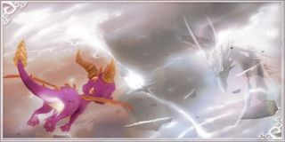
I've always thought this, but it only just occurred to me to make a thread about it now. Does anyone find the cover art for this game weird? If you can't remember, it looks like this:

I'm not even sure what looks off about it. Maybe the fact that his front legs are being used like arms, or that it looks like a superhero pose?
Offline
#2 Jan 20, 2014 12:06 AM
- Flapjacks
- Member

- From: California, United States
- Registered: Jan 20, 2013
- Posts: 1,745
- Gems: 0
- Birthday: 5 October
- Age: 26 years old
- Gender: Male
Re: The Cover Art

A higher res shot.
I think it looks sort of off as well. He seems to have more... human-like(?) front arms, and his facial expression looks a bit weird, at least for Spyro, as well. In most of the games, maybe excluding the LoS games, he seems to have a cynical/careless expression. Also, the combination of his pose, which seems to be adventurous or excited looking seems to not fit with his sort of angry or annoyed face. The colors are a bit weird as well. They seem way to saturated, to the point of his claws on one of his legs appearing yellow.
I'm not sorry if I offended you.
Offline
#3 Jan 20, 2014 7:14 AM
- 36IStillLikeSpyro36
- Member

- Registered: Aug 15, 2008
- Posts: 17,365
- Gems: -4,018
- Website
Re: The Cover Art
it's pretty cool, if you don't look at it too long. they tried WAY too hard to be dark with the logo, and Spyro isn't (physically) anthro, he shouldn't be able to move his forelegs like that. i think the color contrast is also a little too high in the background, but i have a feeling that was intentional, so i don't really feel right complaining.
DeviantArt - https://www.deviantart.com/arterialblack716
YouTube - https://www.youtube.com/user/spyrotheet … ght/videos
imperfect sinner saved by Christ.
Offline
#4 Jan 20, 2014 6:09 PM
- Stormy
- Administrator
- Registered: Jun 01, 2006
- Posts: 10,394
- Gems: 593
- Birthday: 3 April
- Gender: Female
Re: The Cover Art
Good points. I think it is mostly the "arms" and the facial expression.
I actually really like the way the logo looks on this game. It's very... magic-y? Fits the game pretty well.
Offline
#5 Mar 28, 2014 3:58 PM
- The Black Shadow
- Member

- From: Michigan, USA
- Registered: Mar 25, 2014
- Posts: 77
- Gems: 0
- Age: 32 years old
- Gender: Female
Re: The Cover Art
I agree, Spyro just looks goofy here, and a bit too human-like. Another thing I noticed is Spyro's horns seem too small for his head, and his muzzle seems is too big.
Last edited by The Black Shadow (Mar 28, 2014 4:06 PM)
Offline
#6 Mar 29, 2014 1:24 AM
- 36IStillLikeSpyro36
- Member
- Registered: Aug 15, 2008
- Posts: 17,365
- Gems: -4,018
- Website
Re: The Cover Art
it's one of those things; i never noticed it before you pointed it out, but now that you did i can't unsee it.
DeviantArt - https://www.deviantart.com/arterialblack716
YouTube - https://www.youtube.com/user/spyrotheet … ght/videos
imperfect sinner saved by Christ.
Offline
#7 Jun 15, 2014 1:04 AM
- LocoGuy107
- Banned

- From: Spyro'sNotDeadFricklandersIs
- Registered: Apr 28, 2014
- Posts: 661
- Gems: 0
Re: The Cover Art
You gotta admit, the face makes him look better than he ever would in any other picture.
Ban reason: No explanation necessary


 (CoD)
(CoD)
Offline
#8 Jun 15, 2014 1:30 AM
- Stormy
- Administrator
- Registered: Jun 01, 2006
- Posts: 10,394
- Gems: 593
- Birthday: 3 April
- Gender: Female
Re: The Cover Art
I don't care for the way they drew his face here. Something about the expression still seems off to me.
Looking closer at it again, his head kinda looks like they just pasted it on. Like it was part of another image and they Photoshopped it there. I think it has to do with the placement of the head on the neck and the lack of texture on the face compared to the rest of the body.
I have no idea why I'm bothering to analyze this. ![]()
Offline
#9 Jun 15, 2014 8:44 AM
- NeoReaper
- Member

- From: United Kingdom
- Registered: Aug 30, 2013
- Posts: 536
- Gems: 0
- Gender: Male
Re: The Cover Art
He also looks fatter.
-Intel I7 4770k 4.5Ghz / Phanteks U-Type Black -Vengeance (Hynix) 16Gb 1600Mhz -Kingston SSDNow M.2 / 2TB Seagate Constellation
-Asus Intel Z97-P -Zalman z11 Plus Case -Windows 10 Insider Edition -XFX R9 280X 3GB
Offline
Pages: 1